Masthead Analysis
The masthead dominates the main cover. It's the first thing a reader sees when they open the magazine, and it's also what draws them in. The masthead must be presented in a way that distinguishes it from the other magazines.
Mastheads use typefaces to establish a difference between each magazine cover. Typefaces are divided into five categories: serif, sans serif, script, monospaced, and display.
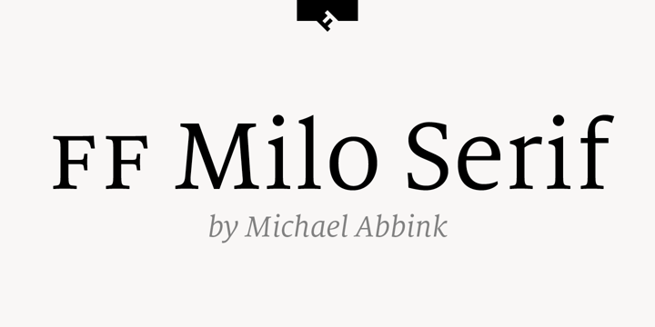
Three Mastheads I have analyzed have Milo Serif, Times New Roman, and Play Fair Display typefaces.
Milo Serif, Times New Roman, and Play Fair Display are all fonts that fit under the category of my sub-genre — science.
A typeface is a collection of similar-looking characters. Letters, numerals, punctuation marks, and symbols are among the characters. Arial, Helvetica, Times, and Verdana are some of the most popular types.

Times New Roman is a font that comes from a sans serif typeface. Serifs have little strokes/extensions at the end of a longer stroke, such as the leg of a "K" or "R" in typography because they have a simpler look than serif fonts, sans serif fonts are popular with brands and are usually easier to read on screens.
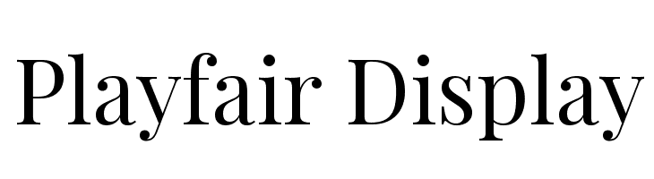
Play Fair Display is a font that comes from a display typeface. Playfair's sophisticated display font looks great when matched with Georgia's text typography. Additionally, a display typeface is a sort of font that is intended for short-form, frequently large-format applications such as billboards or posters, logotypes, magazine or website headlines or headers, and book covers. Display typefaces come in a variety of styles, including serif, slab serif, didone, script, sans serif, and so on. Many types, such as Walbaum, are developed only as display fonts with a variety of decorative elements.
Examples/Ideas:


Comments
Post a Comment